

Civic UX / Data Tool / 2026 / Finished V1
Senator Guardrails
Physical therapy for the grip on power.
A ridiculous idea became a functional civic data product because the comedy and the facts were treated as equally important design constraints.
Vercel authentication required. Finished V1; public access and portfolio publication await review.
- 50
- states
- 100
- reviewed senators
- 47
- service-date corrections
- V1
- approved release candidate
01 / The idea
A ridiculous premise. A useful product.
Public office can start to look like personal property when the same people hold the same seats for decades. I wanted to make that accumulation visible without turning the project into another wall of political outrage.
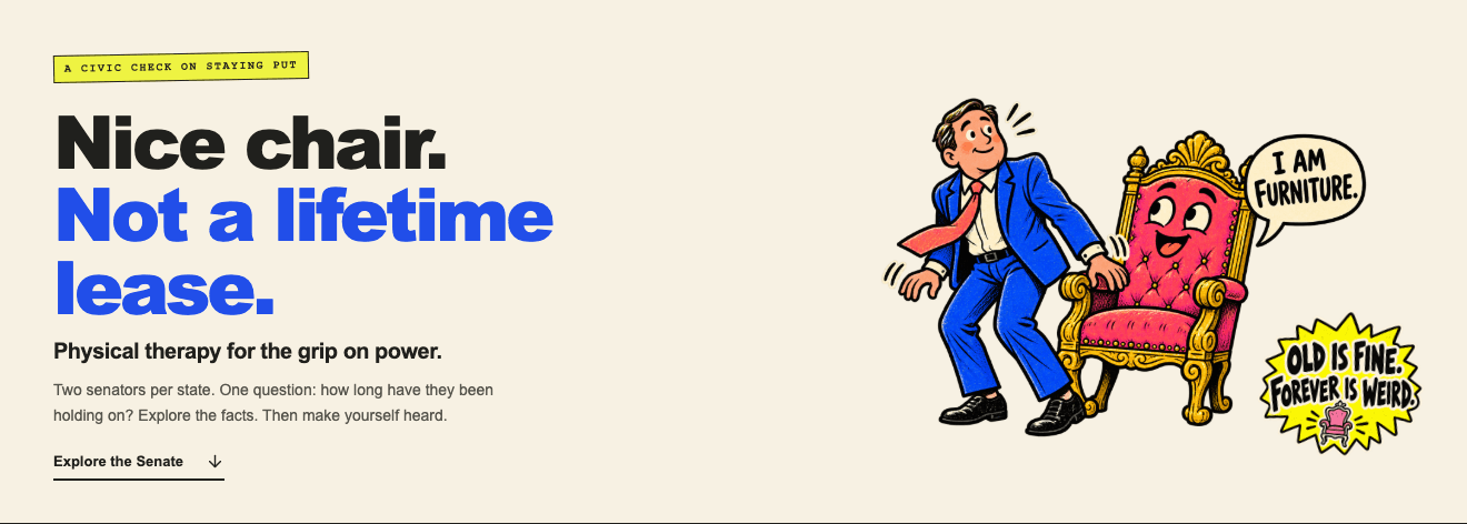
The premise was physical therapy for the grip on power: fictional officeholders who have become inseparable from their chairs. The joke gives the site a world. The map gives people something to do in it.
The editorial boundary was deliberate: OLD IS FINE. FOREVER IS WEIRD. The satire targets unusually long tenure and entrenched institutional power—not age, disability, illness, appearance, competence, or protected traits. Age is separate context, not a diagnosis or a shortcut for judging fitness for office.
02 / Design judgment
Technically working was not enough.
The first explorations used an equal-seat cartogram and type-heavy treatments. Two seats per state is a useful structural idea, but the block-map approach asked visitors to decode a new geography before they could find their own senators. It also carried too much of the experience through typography instead of the cartoon editorial world the concept needed.
I rejected those directions rather than polishing the wrong premise. Research through my Poster Index project helped shift the visual conversation toward illustration, expressive hierarchy, print texture, and a stronger relationship between image and message. It was a research tool for direction, not a substitute for the product interface.
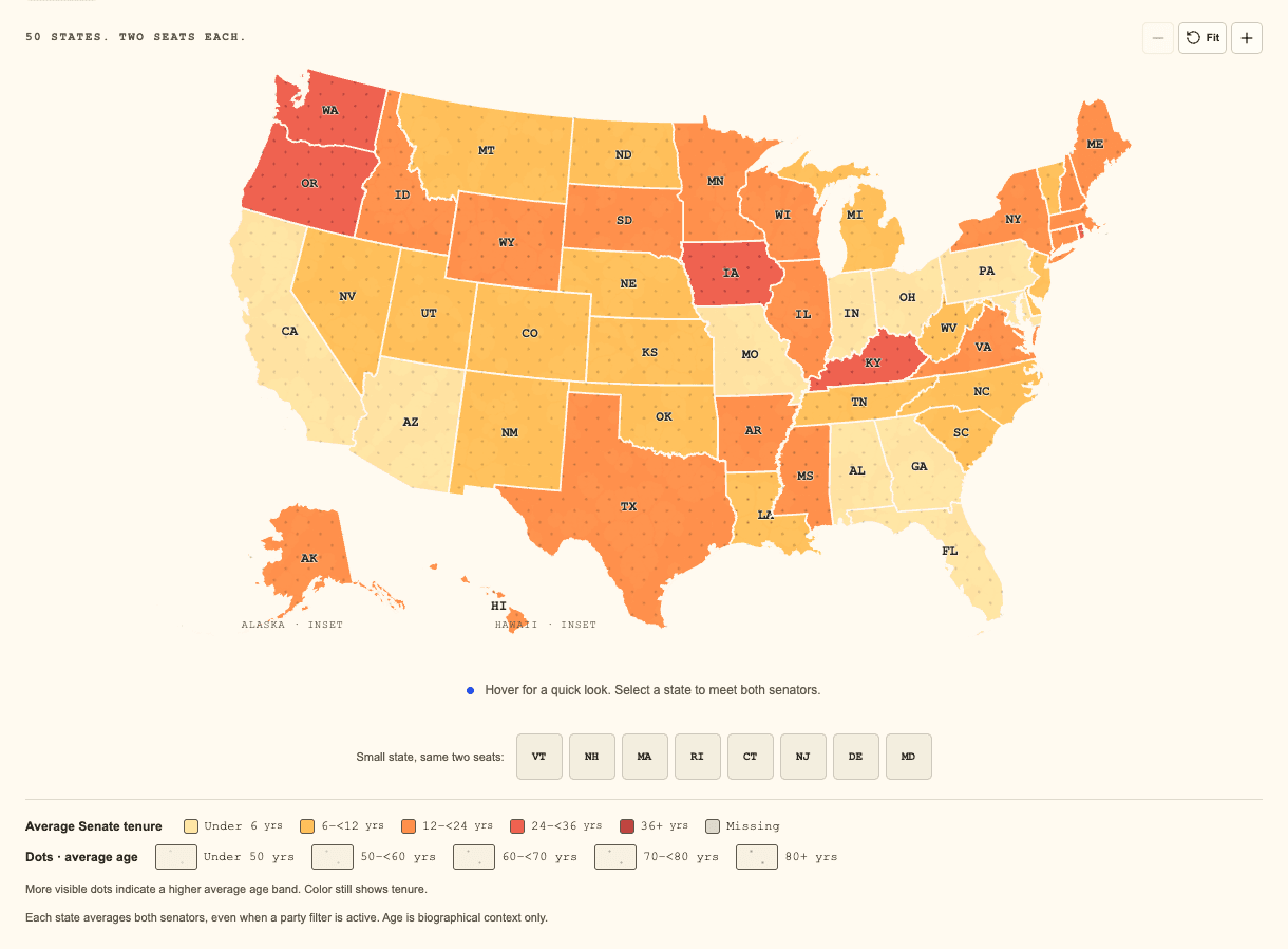
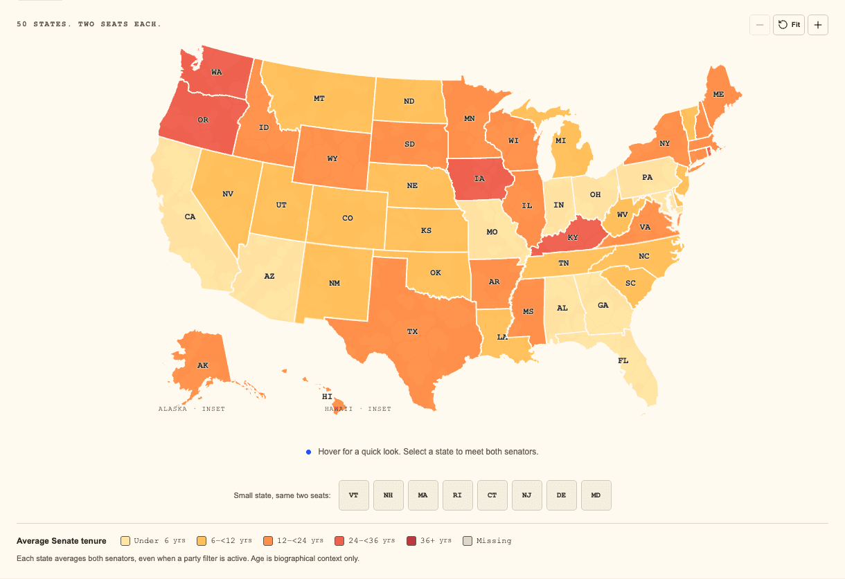
The final map uses recognizable U.S. geography with Alaska and Hawaii insets. The two-seat model survives in the data and state detail: choose one state, see both senators. Geographic familiarity became the entry point; equal representation stayed in the information model.
- Explore
Equal-seat cartograms and type-heavy experiments tested the premise.
- Reject
Working prototypes still missed the illustration-led editorial direction.
- Research
Poster Index informed the move toward a cartoon print vocabulary.
- Build
Custom assets, real geography, responsive profiles, and a practical switchboard.
- Audit
100 records reviewed; 47 service commencement dates corrected.
- Verify
Browser and data checks, then a protected HTTPS release-candidate preview.
The early direction is reconstructed from the creator’s process account. Archived cartogram and type-heavy screens were not available in the canonical project, so no invented “before” interface is shown.
03 / The editorial world
Serious records. Absurd furniture.
Warm cream paper, chunky black outlines, acid yellow, electric blue, coral, pink, and mint gave the project a cartoon editorial identity. Chairs, therapy exercises, speech bubbles, stickers, and restrained print textures carried the institutional joke without borrowing the visual language of a government portal.
The custom asset pack separated hero art, switchboard illustration, stickers, exercises, decor, and textures. The final interface uses selected assets around the information, not every asset simply because it exists. The chair says I AM FURNITURE. The call workflow says PUT THE CALL IN ROLL CALL. Each image has a job.
Fictional illustrations are kept separate from factual profiles. Just the Facts mode removes the satire layer while retaining the map, roster, sources, and contact workflow. Comedy is optional; access to the information is not.

Selected asset vocabulary
Paper. Ink. Institutional furniture.
Hero illustration, call-station art, and expressive stickers sit beside the data. The cream, yellow, blue, coral, pink, and mint palette belongs to the product; the surrounding case study retains CCR515’s visual system.

04 / Map and mobile
Find a state. Keep both seats in view.
The explorer offers tenure, age, and combined views. Tenure uses a warm color scale; age uses its own cooler scale; the combined view keeps tenure color and age dots distinct. Legends and text summaries make the encodings readable without relying on color alone.
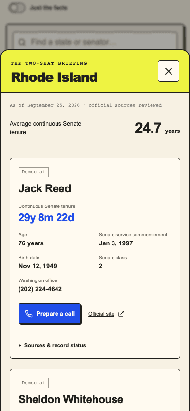
State hover gives a quick read. Selecting a state opens both profiles in a desktop drawer or mobile bottom sheet. Search accepts senator and state names, party filtering narrows the set, and a sortable roster offers another route through the same records. Fit is the default; zoom is optional rather than a requirement for seeing the country.
Small northeastern states have larger equivalent controls. Keyboard traversal, visible focus, selection borders, meaningful modal focus, and reduced-motion behavior were part of the interaction work. The mobile composition was tested down to a 320px browser viewport, with the map fitted and table overflow contained.
05 / From information to action
Put the call in roll call.
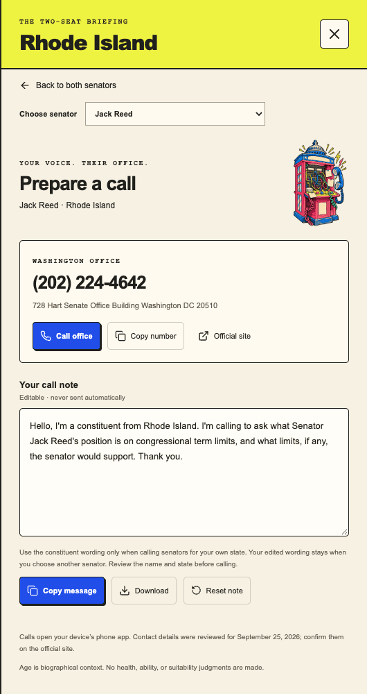
A data experience should not strand people at a number. The switchboard brings the selected senator’s Washington office phone into an editable, neutral call script. It asks for a position on congressional term limits rather than pretending to speak for the visitor.
People can edit, copy, or download their note, then use the phone link themselves. Constituent wording is limited to senators from the caller’s own state. The script survives profile changes and closing the panel until the visitor explicitly resets it. Nothing is automatically sent, and testing did not place a real call.
06 / Research and verification
The jokes could be fictional. The records could not.
The September 25, 2026 snapshot contains 50 states and 100 reviewed senators, exactly two per state. The factual review checked eight requested fields per record—800 checks—and corrected 47 Senate service commencement dates. Membership, state, party, class, birth dates, official sites, and Washington office numbers were supported by archived congressional and Senate sources.
The biggest correction was conceptual as well as numerical. Service commencement, appointment, oath, and seniority dates are not interchangeable. The project follows the Senate Historical Office commencement convention for the current uninterrupted Senate spell, excludes House service, and records exceptions and source disagreements rather than smoothing them away.
The audit preserves the original records, reviewed records, a before-and-after correction ledger, per-record checks, source locators, retrieval times, and evidence checksums. Direct Bioguide access was unavailable during the audit; alternative official sources were used and the limitation was documented. This is a source-supported review, not official certification or a claim that contact details will remain current forever.
Evidence, not just a claim
Every correction has a trail.
100 records × 8 fields → 800 checks → 47 corrections → reviewed snapshot
Download the project’s factual audit ↗Download the 47-correction ledger ↗Primary records: Senate directory · Senate Historical Office chronology · Congressional Directory
07 / How it is built
A small system with explicit boundaries.
React and TypeScript organize the explorer, roster, profiles, and switchboard. Vite builds the application. D3 turns locally bundled TopoJSON geometry into SVG state paths; geometry and fixed-snapshot summaries are computed once rather than repeated on pointer movement.
Structured Senate records feed shared validation and metric functions. Ages and tenure are derived at the fixed snapshot date, so the interface does not silently change its claims as the calendar advances. Geographic data, factual records, calculations, and editorial assets remain separate layers.
Vercel hosts the HTTPS release-candidate preview. It currently requires Vercel authentication. The portfolio links to that protected preview explicitly; it does not embed a login wall or describe the product as a publicly accessible launch.
- Official records
archived source evidence - Reviewed snapshot
validation + fixed-date metrics - SVG explorer
map, roster, profiles - Call workflow
local note, user action
08 / Testing and release
Evidence beyond a polished screenshot.
The approved release candidate passed structural validation, ten application tests, and the TypeScript/Vite production build. Tests reconcile the 800 audited values and 47 corrections, verify archived evidence hashes, and cover fixed-date calculations, boundary conditions, invalid input, and missing data.
Recorded Chromium checks cover desktop, tablet, and mobile viewports; map modes and fitting; search and roster; profile and call flow; keyboard navigation; modal focus; reduced motion; clipboard and download behavior. The release pass also checked the service-commencement label and own-state wording.
The result is finished V1, with an approved release-candidate commit and a protected HTTPS preview. Physical iPhone Safari and VoiceOver acceptance remain pending. Browser viewport emulation and keyboard review are useful evidence, but they are not a full accessibility certification.
09 / Role and reflection
Direction was the work.
I conceived and directed Senator Guardrails, shaped the UX and editorial framing, researched visual direction, orchestrated the custom asset system, guided the architecture, reviewed the factual evidence, and drove iteration and verification through AI-assisted development. I did not manually write every line of code. My responsibility was deciding what the product should be, recognizing when it was wrong, and carrying those decisions into a functioning system.
The useful lesson was that comedy and rigor do not have to cancel each other out. They need different boundaries. Illustration can exaggerate the institution while factual profiles remain sober. A familiar map can make an unusual premise usable. And rejecting a technically successful prototype can be the decision that makes the finished product coherent.
V1 proves the interaction and editorial system. Advancing the data snapshot requires another factual review; publishing the portfolio update requires a separate review. The next step is to judge the real experience, not add more jokes to a product that already has a clear point.